Author: Bryan Thatcher

Initial thoughts on the just-released iOS7

imageWWDC 2013, a success or failure? In the second year since the passing of Steve Jobs, much has changed—some for the better, some meh. The big news this year is the release of iOS7 the design is headed up, for the first time, by head product designer Jonathan “Jony” Ive.

Overall, I like iOS7.

First, for my personal taste on color, it’s a bit too pastel and feminine—not necessarily bad, just not my preference—and it’s kind of bright, making it a bit hard on the eyes. I prefer a darker color palette. That said, I do like the minimal-color, use of black and white in the apps.
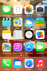
The icons are hit and miss for me. Hits: Messages, Calendar, Photos, Maps, Clock, and Game Center. Misses: Safari, Phone, Camera, and Weather. Those not mentioned fall somewhere in the middle. As far as the scrubbing of the skeuomorphism goes, why is there an old fashion telephone handset as an icon? Why does the camera icon look like a camera? I prefer the old one. Maybe if the color palette was different, they wouldn’t bother me so much.

image1I like the minimalist approach, but this feels a little under designed. I like the new uniform design across all the apps, as the inconsistency always bothered me—now they feel uniform, like a suite. One new inconsistency I noticed is the Notifications panel is solid, but the Control Center panel is very transparent—too transparent, in my opinion.

image2

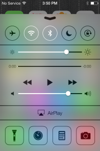
I like the new type treatment. My only complaint is using a light-colored image as wallpaper, makes the type hard—if not impossible—to read. I find it strange the top bar has a slight drop shadow, but the time, date, and slide to unlock do not, nor do the names of the apps.

I’m surprised by the choice to remove “buttons” and instead use simple text links and icons. I’m happy to see the ugly date scroller gone, replaced with a more elegant one. I’m also surprised there isn’t more gesture navigation. For example, in the Photos app, I would like to swipe to move between Moments, Collections, and Years. While in Years, I have a hard time targeting the tiny icon, though I suppose that will change as the photo library grows. But a simple swipe in Years really should bring me back to Collections.

I’m liking iTunes Radio, too, but I’m not sure if it will replace Spotify for me—time will tell

I’m not going to go through every app, but general functionality has improved across the board. The calendar has improved dramatically, though I wish the Mail app did, too. It has some improvements, but I would like to see more, even something as simple as “Reminder from this Email.” I often read an email on my iPhone, but need to respond from my desktop—once at the office, I get distracted and miss the message because it’s no longer on the first page.

I like the new camera app, but being the photo geek I am, I would rather see some more robust features—like ISO or aperture control—rather than filters, which I almost never use. But then again, I generally use my Panasonic DMC-LX7 tethered to my iPhone via an Eye-Fi card.

Good—but not great—job by Jony and Scott.

PivotCon 2012 Highlights

“Vision, trust, and transparency.” This was Stowe Boyd’s summary of the current state of the new “Post Normal” Era of Business. His perspective was a recurring theme throughout Pivot Con.

pivot

Some other thoughts…

On Vision: Be flexible on details, and stubborn on vision. A great example is Marc Benioff’s vision, which is all about the future. He speaks about the future as if it is the present, allowing his employees to fill in the details. Vision must be rooted in the future and not the past.

On Workforce: Embrace the “3D” worker who is distributed, decentralized, and discontinuous. It’s about being mobile, utilizing tablets and ultra notebooks.

On Leadership: Smaller groups with a fail fast mentality towards risk taking result in less management and flatter organizations.

On Social: All employees are the voice of the company, creating a company wide endeavor. While management will set the tone, the employees will be trusted to convey the messages. The new employee brand ambassadors receive extensive training in how the company’s messaging is executed. This creates a culture of collaborators having perpetual conversations. These conversations are happening internally as well as externally. Social is here and it’s not simply a department!

On Facebook: Coke shared some insights into who are the ultimate fans of the brand. At over 50 million fans, Coke has the highest number of Facebook fans than any other brand. They used brand connections, the ratio of the number of people in their network and how many of their friends also follow the Coke page. They took a sampling of the fans and looked at low noise fans .66 brand connections, and high noise fans 30+ brand connections. They found that engaging the high noise fans demands disproportionately high connectivity, 30 times more than the lower noise fan. They effectively identified small clusters of fans with strong influence on their friends, rather than targeting influencers.

On Content: Consumers love stories! No longer relying on press releases and product pitches, It is all about storytelling. Stories engage the consumers, thus allowing the users to personally connect with the brand.

On UX: The user experience is not just your website or mobile application. It’s everything your company does, including customer service, social engagement, etc.

On Development: If you don’t ship, it doesn’t exist. Ship fast and ship often. Sephora ships every 6 weeks, with new features and enhancements.

On Devices: One word, mobile! While the desktop is not dead, it is on life support. The process is now: mobile, tablet, desktop. As the tablet market increases that might change to: tablet, mobile, desktop. 44% of all sales will be done on a mobile/tablet device with 80% taking place on the tablet.

On Search: YouTube is the number 2 search engine! It is also the number one place people go to find out about companies and brands, they do not go to brand websites or even Facebook pages first.

On Engagement: Without engagement a company does not have a pulse! Engagement is not an ROI metric, but more of a company health metric. This is very important. Your company’s digital IQ directly reflects in shareholder value.

On Advertising: Consumers have more trust in Earned Advertising rather than in paid ads, resulting in an ROI 14 times greater for the earned versus the paid. A growing trend is a combination of the two forms and a hybrid of the two to amplify the earned ads.

On Cool: What makes a product cool and how do you measure it? The impact of cool is important to all demographics, but it differs between them. Cool is something that is below the conscious ability to measure with traditional tools. It’s more reliably measured on non-conscious methods. Buyology has come up with a method of having people ask questions about a product. They can then determine where that product falls on a coolness factor. Cool characteristics: Authentic, Inspiring, Creative, Attractive, Edgy, Rebellious, Mysterious, Surprising, Takes Risks, Unique.

Linkedin launches Visualization Tool

linkedin

For you data Junkies out there, Linkedin launched a new tool, inMaps on linkedinlabs yesterday. This new tool helps you visualize your social graph by grouping people you are connected to and color codes them. For example it grouped all the past and current Fuseboxers into one color group, too bad you have to accept the default color scheme as I would have preferred the Fusebox group to be orange. It also identifies the influencers in your network by making their bubbles larger. Clicking on one of your contacts results in seeing all their connections. I’m looking forward to exploring my network a bit more in-depth. Check out my inMap.

The revolution is here… and it’s all about touch.

iPadAfter Apple’s recent iPad launch, the act of browsing and consuming content has made a small — but radical — change.

In fact, over 300,000 units (sold day one) are now in the excited hands of a highly influential group of users… and they’re headed straight for you.

Is your Web site ready for a new kind of visitor?

It might seem like a small change, but the move from ”mouse to fingers“ means your interactivity and user experience will need to take a big leap forward.

We are at the beginning of a movement, literally, no longer will you be pointing and clicking your way through the web,  you will be touching, pinching and swooshing — more poetry and dance than hammers and saws.

Fusebox wants to make sure you’re providing the kind of experience your users and customers need — and we’ll help you do it, from comprehensive site analysis, to key site modifications.

We offer:

  • Custom CSS specifically designed for the iPad
  • .jpg file replacement for all your flash content
  • Redevelopment of your flash content in HTML 5
  • Redevelopment of your video assets to HTML 5
  • Form modification for iPad keyboard users
  • Form modification for iPad capitalization protocols
  • Overall usability tweaks to prep your site for the touch devices

Is your site ready? We can help.

Get in touch today! or call 212-929-7644

Read John Doerr’s account of why the iPad is the next big thing.


Job Opportunities

We have two job openings; one is for an intern and the other a junior designer. If you’re just beginning your career in Web design and are looking to gain some hands-on experience, grab the intern position. If you have already have some experience in Web design and are looking for a new challenge that will let you take your skills further, then the junior designer position maybe be just what you’re looking for.