Category: Design

Initial thoughts on the just-released iOS7
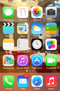
imageWWDC 2013, a success or failure? In the second year since the passing of Steve Jobs, much has changed—some for the better, some meh. The big news this year is the release of iOS7 the design is headed up, for the first time, by head product designer Jonathan “Jony” Ive.

Overall, I like iOS7.

First, for my personal taste on color, it’s a bit too pastel and feminine—not necessarily bad, just not my preference—and it’s kind of bright, making it a bit hard on the eyes. I prefer a darker color palette. That said, I do like the minimal-color, use of black and white in the apps.
The icons are hit and miss for me. Hits: Messages, Calendar, Photos, Maps, Clock, and Game Center. Misses: Safari, Phone, Camera, and Weather. Those not mentioned fall somewhere in the middle. As far as the scrubbing of the skeuomorphism goes, why is there an old fashion telephone handset as an icon? Why does the camera icon look like a camera? I prefer the old one. Maybe if the color palette was different, they wouldn’t bother me so much.
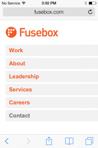
image1I like the minimalist approach, but this feels a little under designed. I like the new uniform design across all the apps, as the inconsistency always bothered me—now they feel uniform, like a suite. One new inconsistency I noticed is the Notifications panel is solid, but the Control Center panel is very transparent—too transparent, in my opinion.
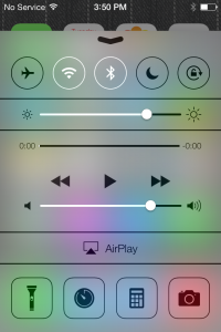
image2

I like the new type treatment. My only complaint is using a light-colored image as wallpaper, makes the type hard—if not impossible—to read. I find it strange the top bar has a slight drop shadow, but the time, date, and slide to unlock do not, nor do the names of the apps.

I’m surprised by the choice to remove “buttons” and instead use simple text links and icons. I’m happy to see the ugly date scroller gone, replaced with a more elegant one. I’m also surprised there isn’t more gesture navigation. For example, in the Photos app, I would like to swipe to move between Moments, Collections, and Years. While in Years, I have a hard time targeting the tiny icon, though I suppose that will change as the photo library grows. But a simple swipe in Years really should bring me back to Collections.

I’m liking iTunes Radio, too, but I’m not sure if it will replace Spotify for me—time will tell

I’m not going to go through every app, but general functionality has improved across the board. The calendar has improved dramatically, though I wish the Mail app did, too. It has some improvements, but I would like to see more, even something as simple as “Reminder from this Email.” I often read an email on my iPhone, but need to respond from my desktop—once at the office, I get distracted and miss the message because it’s no longer on the first page.

I like the new camera app, but being the photo geek I am, I would rather see some more robust features—like ISO or aperture control—rather than filters, which I almost never use. But then again, I generally use my Panasonic DMC-LX7 tethered to my iPhone via an Eye-Fi card.

Good—but not great—job by Jony and Scott.

Mathematics in Design

You may have heard of the Golden Ratio before and how it’s geometry is aesthetically pleasing. A couple of days ago, we had our own special geometry to solve. Our Creative Director Steve Newman @moodyjive came to me with a challenge. He was designing a compound shape and wanted to divide it into equal parts. He was currently eyeballing it, but something just didn’t feel right about that technique to him. As the perfectionists we are here at @fusebox, I’d thought I could lend a hand or a pencil if you will. I told him we’d solve this with closed form mathematics as his object was simply made up of a combination of circles and rectangles. Quite the skeptic, Steve handed over the problem to me.

The object he wanted to divide, first into 4 equal slices and then 3 equal slices, is pictured below. Here’s the problem statement in words.

    Given a fixed outer radius of the arc Ro, a fixed inner radius of the arc Ri, and a fixed height of the pillar h, determine the slicing point angle from the horizontal such that we will have four equal areas. Our slice is defined as the angle \alpha in degrees but in geometry it’s often more convient to work in radians because it directly relates the length of an arc to a radius and works great in equations. For those that don’t remember or don’t know, 360 degress is equal to 2\pi radians.

First Four equal parts.

Since we have vertical symmetry, we can just use the left side of the inverted U noting the vertical cut is necessary. The area of a complete donut is simply described as the area of a circle with radius Ro minus the area of a circle with radius of Ri. We then need to divide the area of a complete donut by the ratio of the arc length of the inner radius of A1. Recalling high school mathematics, the arc length is simply a radius multiplied by the coverage angle in radians or simply  Ri (\pi/2 - \alpha) . This proportion of entire area of a circular arc is simply the arc length divided by the circumference of the cirle or Ri (\pi/2 - \alpha)  / 2 \pi Ri  . Notice that the proportion is equal 1/4 the area of a circle when the angle is zero.

Therefore the arc area:

A1 = \pi (Ro^{2}-Ri^{2}) Ri * (\pi/2 - \alpha) / 2 \pi Ri =  (\pi/2 - \alpha) (Ro^{2}-Ri^{2}) / 2

The area of the rectangular pillar of height h is then the area of the rectangle with thickness Ro-Ri and height of h plus the area of the complementary arc that sweeps through \alpha.

A2 = h ( Ro - Ri ) +   Ri  \alpha / (2 \pi Ri )    \pi (Ro^2 - Ri^2)     =  h ( Ro - Ri ) + \alpha   (Ro^2 - Ri^2) / 2

What we need to do is solve for \alpha when we set A1=A2. Expanding the equations, and then group by \alpha one can readily show the solution is:

\alpha = [ \pi /4 (Ro^2 - Ri^2) - h(Ro - Ri) ] / (Ro^2 - Ri^2)

When we substitute his values Ro = 51, Ri=27, h=24, we find that \alpha is 0.47771 radians or 27.37 degrees.

Note: because we relied on symmetry, the equation is valid for \alpha between 0 and 90 degrees only.

The math for dividing into three (3) equal areas is quite similar and left as an exercise to the reader, We’re calling the angle \beta. Here’s the sketch. Put your answer in the comments if you dare for the same geometry. I’ll post our answer on Friday. 🙂

UPDATE: 7/26/2011
Given the same geometry, our angle \beta is 48.247 degrees.

Fusebox launches Chardan Capital Markets redesign and new positioning

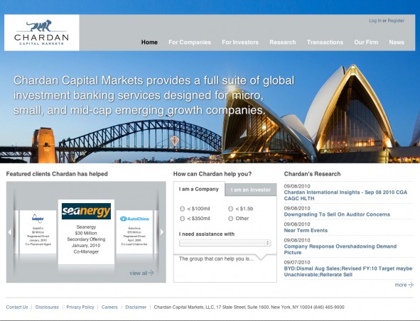
Chardan Capital Markets provides a full suite of global investment banking services designed for micro, small and mid cap emerging growth companies. Chardan is also an industry leader in SPAC transactions and became one of the first firms to establish a presence in China.

Fusebox was retained to reposition, rebrand and redesign their website to better serve their customers and provide them with a competitive edge in the industry.

Fusebox helped streamline their business process by creating a website that could be self managed. Built on the Drupal open source platform we provided Chardan with a robust content management system. The new website features a custom “tombstone generator”, providing their team with tools to generate tombstones on the fly to display as deals are completed.  A “How can Chardan help you?” wizard was developed to assist clients in determining which division would be most appropriate to contact for assistance. A robust user management system was developed that allows Chardan to publish their proprietary research content to existing clients and collect registration information from potential clients looking to retain Chardan for their expertise.

BET Foundation gets a fresh, new website

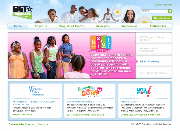
Together with BET Foundation, Fusebox is delighted to announce the launch of the redesigned BET Foundation Web site, the result of several months of close collaboration between these two organizations.

Fusebox’s design team created a fresh, light look and feel for the new Web site, incorporating appealing imagery reflective of the BET Foundation’s health focus and target audience. Our writers revised the site copy to establish a consistent tone and style and enhanced on-screen legibility. To help site visitors quickly locate the information they need, we reorganized all site content and introduced a new navigation scheme.

Our development team implemented the site in Drupal CMS to enable BET Foundation’s busy staff members to quickly update content with minimal training and no prior technical experience. The new site also features online registration and evaluation, complete with user management capabilities to allow BET’s staff to quickly and easily administer programs and events.

More Art, More Happiness. Now Available Online.

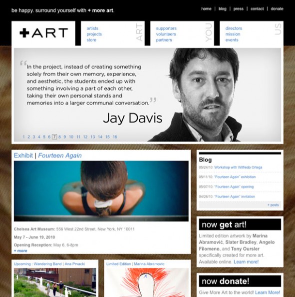
Fusebox and More Art are pleased to announce the launch of More Art’s new iPad and mobile device compatible Web site. A New York-based nonprofit organization, More Art is dedicated to forging links between contemporary art, artists, and the community at large.

A member of More Art’s executive board, Fusebox Partner and Executive Creative Director Laura Michaels has helped facilitate a close and productive working relationship between the two organizations. The Web site redesign is a natural extension of the collaboration between More Art and Fusebox.

More Art owes so much to the talent of Laura Michaels and her creative team at Fusebox for the exciting makeover they’ve given our Web site. Previously cumbersome and difficult to navigate, the new site presents our achievements and mission in a fresh, user-friendly light. Laura and her team have a natural feel for design and the innate ability to understand their clients’ needs and goals. “Visually-riveting, forward-thinking, sophisticated and cool” – that’s how we describe the new site Fusebox has designed for More Art. – Michaela Martegani, More Art Founder & Director

To ensure that the art serves as the focal point of the site, Fusebox’s design team created a contemporary, minimalist look and feel. The new site structure addresses More Art’s three main audiences – artists, supporters, and organization members. Through the use of social media applications, including a blog and both Facebook and Twitter integration, the site also looks to establish stronger connections with a broader audience.

More Art Web Site screenthot

E-commerce functionality has been incorporated to enable More Art to receive online donations and allow users to purchase “Multiples” – limited edition art objects created by renowned artists for the exclusive benefit of More Art. Fusebox’s development team opted to implement the site in WordPress to allow More Art’s small staff to quickly and efficiently update site content.

The site adheres to HTML 5 standards to eliminate the need for proprietary plugins and to facilitate the viewing of all site content, including animations, on iPad and mobile devices.

Tonight: Fusebox sponsoring fundraiser to benefit poor and homeless

With social media – Facebook, Twitter, YouTube – now nearly as ubiquitous as cell phones, as a digital agency, we spend a lot of time thinking about how to monetize these new platforms for our clients. We are, after all, a for-profit business. But that doesn’t mean we’re just about profit. Using our skills to try to make the world a little bit better has always been a key part of our philosophy at Fusebox.

One of the ways we’re currently doing that is by sponsoring the Social Media for Social Change (SM4SC) fundraiser for Camillus House, being held tonight at Club 50 at the Viceroy, in Miami. SM4SC connects people actively involved in the social media arena – technologists, PR professionals, bloggers, etc. – with non-profit organizations to help them use these new tools and platforms to maximize their fundraising efforts. Camillus House, serves poor and homeless men, women and children living in South Florida.

We’re inspired by the amazing work that both of these organizations are doing, and we’re proud to have the opportunity to support them.

Olympic Logo Design, Love it or Hate it!

olympic_logo

Wolff Olins’ work on London’s 2012 Olympic logo has been the topic of many debates on logo design. Initially I thought flasback to the 80’s! Then I thought wow no gradient reflections, no faux 3d with highlights, atypical color choice,  he’s breaking all the rules and all the current trends. I think for that reason alone I love it, I’m curious to see it integrated with marketing materials, that should be some challenge.

Fusebox speaks at NYU on social media & non-profits

Bryan and I spoke at New York University to a group of MBA students enrolled in “Development for the Visual Arts,” a course which examines fundraising opportunities for not-for-profit organization. Our talk focused on Social Media and its applications for fundraising in the not-for-profit world. We discussed everything from brand building to execution and how social media, when used well, can open real dialogue between organizations and the community or, in other words, to “Stop marketing and start talking.”

The talk is best summarized in the letters we received from a number of students thanking us for our time. Below is one of my favorites.

“Thank you so much for coming in to speak with our class last night. It was fascinating to hear you both talk about the importance of social networking for organizations. You made an interesting point that doing this is not necessarily to sell the audience, but rather to get your name out and connect with your audience. It was inspirational, to say the least, to see that your work comes from a genuine desire to be innovative, be honest, and connect people. Like you said: Make a promise to your audience, and then keep that promise.

Not only was it fantastic to hear you two speak, but I must admit, I was a bit star struck when I discovered that I was in the presence of two people behind one of my favorite childhood memories, “Natalie’s Backseat Traveling Webshow.” I was nine years old, and insisted that my father show me how to start a “webshow” of my own…on Microsoft Word. My offline writing about my travels around my living room may have only lasted a week, but here I am, fourteen years later, with a blog.

So, again, thank you so much for coming to speak to our class. It was truly a privilege to receive advice from such sincere and successful people.”