Fusebox Honored in the 18th Annual Webby Awards

GE Capital Bank Website

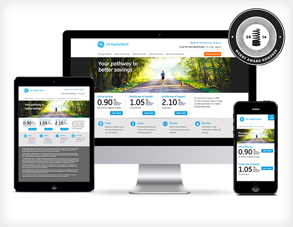
New York — April 11, 2014 – Fusebox was proud to announce today that the agency has been honored for its work on the GE Capital Bank Website (https://www.gecapitalbank.com) in the “Financial Services/Banking Websites” category in the 18th Annual Webby Awards. Hailed as the “Internet’s highest honor” by The New York Times, The Webby Awards, presented by the International Academy of Digital Arts and Sciences (IADAS), is the leading international award recognizing excellence on the Internet. The IADAS, which nominates and selects The Webby Award Winners, comprises web industry experts, including media mogul Arianna Huffington, Skype CEO Tony Bates, Mozilla CEO and Chair Mitchell Baker, Instagram co-founder Kevin Systrom, mobile-phone inventor Martin Cooper, and the Creator of the GIF Steve Wilhite.

“Honorees like Fusebox are setting the standard for innovation and creativity on the Internet,” said David-Michel Davies, Executive Director of The Webby Awards. “It is an incredible achievement to be selected among the best from the 12,000 entries we received this year.”

The 18th Annual Webby Awards received 12,000 entries from over 60 countries and all 50 states. Among the 12,000 entries submitted, fewer than 15% experienced the privilege of being deemed an Official Honoree.

Fusebox
Fusebox is an independent agency focused on the digital customer experience. Founded in 1999, and located in New York City, Fusebox specializes in Retail Banking and Financial Services, delivering expertise in business strategy, user experience design, marketing, programming and mobile development.

About The Webby Awards
Hailed as the “Internet’s highest honor” by The New York Times, The Webby Awards is the leading international award dedicated to honoring excellence on the Internet, including Websites, Interactive Advertising & Media, Online Film & Video, Mobile & Apps, and Social. Established in 1996, The Webby Awards received nearly 12,000 entries from all 50 states and over 60 countries worldwide this year. The Webby Awards is presented by the International Academy of Digital Arts and Sciences (IADAS). Sponsors and Partners of The Webby Awards include: Microsoft, Dell, Vitamin T, MailChimp, Engine Yard, Funny or Die, AdAge, Percolate, Mashable, Business Insider, Internet Week New York and Guardian News and Media. Continue reading

Initial thoughts on the just-released iOS7

imageWWDC 2013, a success or failure? In the second year since the passing of Steve Jobs, much has changed—some for the better, some meh. The big news this year is the release of iOS7 the design is headed up, for the first time, by head product designer Jonathan “Jony” Ive.

Overall, I like iOS7.

First, for my personal taste on color, it’s a bit too pastel and feminine—not necessarily bad, just not my preference—and it’s kind of bright, making it a bit hard on the eyes. I prefer a darker color palette. That said, I do like the minimal-color, use of black and white in the apps.
The icons are hit and miss for me. Hits: Messages, Calendar, Photos, Maps, Clock, and Game Center. Misses: Safari, Phone, Camera, and Weather. Those not mentioned fall somewhere in the middle. As far as the scrubbing of the skeuomorphism goes, why is there an old fashion telephone handset as an icon? Why does the camera icon look like a camera? I prefer the old one. Maybe if the color palette was different, they wouldn’t bother me so much.

image1
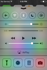
I like the minimalist approach, but this feels a little under designed. I like the new uniform design across all the apps, as the inconsistency always bothered me—now they feel uniform, like a suite. One new inconsistency I noticed is the Notifications panel is solid, but the Control Center panel is very transparent—too transparent, in my opinion.
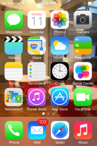
image2

I like the new type treatment. My only complaint is using a light-colored image as wallpaper, makes the type hard—if not impossible—to read. I find it strange the top bar has a slight drop shadow, but the time, date, and slide to unlock do not, nor do the names of the apps.

I’m surprised by the choice to remove “buttons” and instead use simple text links and icons. I’m happy to see the ugly date scroller gone, replaced with a more elegant one. I’m also surprised there isn’t more gesture navigation. For example, in the Photos app, I would like to swipe to move between Moments, Collections, and Years. While in Years, I have a hard time targeting the tiny icon, though I suppose that will change as the photo library grows. But a simple swipe in Years really should bring me back to Collections.

I’m liking iTunes Radio, too, but I’m not sure if it will replace Spotify for me—time will tell

I’m not going to go through every app, but general functionality has improved across the board. The calendar has improved dramatically, though I wish the Mail app did, too. It has some improvements, but I would like to see more, even something as simple as “Reminder from this Email.” I often read an email on my iPhone, but need to respond from my desktop—once at the office, I get distracted and miss the message because it’s no longer on the first page.

I like the new camera app, but being the photo geek I am, I would rather see some more robust features—like ISO or aperture control—rather than filters, which I almost never use. But then again, I generally use my Panasonic DMC-LX7 tethered to my iPhone via an Eye-Fi card.

Good—but not great—job by Jony and Scott.

Abraham Lincoln

Krzysztof Wodiczko, Abraham Lincoln: War Veteran Projection, 2012 from More Art on Vimeo.

Abraham Lincoln is experiencing a bit of a renaissance this year, due in no small part to Steven Spielberg’s upcoming film, “Lincoln” — a labor of love for the director that is already generating Oscar buzz. And as Veteran’s Day approaches, an important new exhibit will put the 16th president in the spotlight yet again… literally!

At dusk on November 9th, in collaboration with Krzysztof Wodiczko and 14 veterans of the U.S. wars in Iraq and Afghanistan, More Art is launching a public exhibit at the Abraham Lincoln statue in Union Square Park entitled, “Abraham Lincoln: War Veteran Projection.”

The bronze statue has stood silently in the park since 1870, commissioned in the years following the close of the Civil War. Wodiczko’s aim is to bring Lincoln’s figure to life through three-dimensional projections, featuring the until-now-unheard stories of those who have fought bravely on our behalf.

Wodiczko spent months speaking to dozens of veterans and their families about the toll of duty and service on their lives, and ultimately filmed conversations with 14 of them. For the next 31 days, these conversations will be projected via sound and light onto the statue, allowing each person’s own words, voice, and gestures to convey their experiences in an unforgettable way.

As our troops begin to return from Afghanistan, there is a tremendous opportunity to start a dialogue about the impact of war on our nation, and on those individuals who serve in our stead. “Abraham Lincoln: War Veteran Projection” provides a powerful glimpse into the hearts, minds, and lives at the core of that conversation — and compels a response.

As a More Art board member for over 6 years, I am thrilled to be a part of this special exhibit launching Friday, November 9 at dusk in Union Square Park, New York City.

Video produced by Fusebox.

PivotCon 2012 Highlights

“Vision, trust, and transparency.” This was Stowe Boyd’s summary of the current state of the new “Post Normal” Era of Business. His perspective was a recurring theme throughout Pivot Con.

pivot

Some other thoughts…

On Vision: Be flexible on details, and stubborn on vision. A great example is Marc Benioff’s vision, which is all about the future. He speaks about the future as if it is the present, allowing his employees to fill in the details. Vision must be rooted in the future and not the past.

On Workforce: Embrace the “3D” worker who is distributed, decentralized, and discontinuous. It’s about being mobile, utilizing tablets and ultra notebooks.

On Leadership: Smaller groups with a fail fast mentality towards risk taking result in less management and flatter organizations.

On Social: All employees are the voice of the company, creating a company wide endeavor. While management will set the tone, the employees will be trusted to convey the messages. The new employee brand ambassadors receive extensive training in how the company’s messaging is executed. This creates a culture of collaborators having perpetual conversations. These conversations are happening internally as well as externally. Social is here and it’s not simply a department!

On Facebook: Coke shared some insights into who are the ultimate fans of the brand. At over 50 million fans, Coke has the highest number of Facebook fans than any other brand. They used brand connections, the ratio of the number of people in their network and how many of their friends also follow the Coke page. They took a sampling of the fans and looked at low noise fans .66 brand connections, and high noise fans 30+ brand connections. They found that engaging the high noise fans demands disproportionately high connectivity, 30 times more than the lower noise fan. They effectively identified small clusters of fans with strong influence on their friends, rather than targeting influencers.

On Content: Consumers love stories! No longer relying on press releases and product pitches, It is all about storytelling. Stories engage the consumers, thus allowing the users to personally connect with the brand.

On UX: The user experience is not just your website or mobile application. It’s everything your company does, including customer service, social engagement, etc.

On Development: If you don’t ship, it doesn’t exist. Ship fast and ship often. Sephora ships every 6 weeks, with new features and enhancements.

On Devices: One word, mobile! While the desktop is not dead, it is on life support. The process is now: mobile, tablet, desktop. As the tablet market increases that might change to: tablet, mobile, desktop. 44% of all sales will be done on a mobile/tablet device with 80% taking place on the tablet.

On Search: YouTube is the number 2 search engine! It is also the number one place people go to find out about companies and brands, they do not go to brand websites or even Facebook pages first.

On Engagement: Without engagement a company does not have a pulse! Engagement is not an ROI metric, but more of a company health metric. This is very important. Your company’s digital IQ directly reflects in shareholder value.

On Advertising: Consumers have more trust in Earned Advertising rather than in paid ads, resulting in an ROI 14 times greater for the earned versus the paid. A growing trend is a combination of the two forms and a hybrid of the two to amplify the earned ads.

On Cool: What makes a product cool and how do you measure it? The impact of cool is important to all demographics, but it differs between them. Cool is something that is below the conscious ability to measure with traditional tools. It’s more reliably measured on non-conscious methods. Buyology has come up with a method of having people ask questions about a product. They can then determine where that product falls on a coolness factor. Cool characteristics: Authentic, Inspiring, Creative, Attractive, Edgy, Rebellious, Mysterious, Surprising, Takes Risks, Unique.

Usability: Using the System Usability Scale (SUS) in Practice

Often times we’re asked to perform system usability studies to derisk the launch of a new site. If it’s late in the process (not atypical) one of the first things we’ll do is come up with a high level subjective view of usability. We use our in-house team as well as our network of usability consultants to come up with a simple assessment.

Our assessment uses the popular system usability scale (SUS) framework to come up with an industry standard score that evaluates the system as a whole. SUS comprises a high level questionairre that by design is quite general. We want to identify if the system in question is inherantly problematic or not. If it is problematic, we’ll dig deeper, if not, we’re ready to move on.

The questionairre asks a user to respond from a list of statements using a five-point Likert scale that ranges from Strong Disagreement to Strong Agreement.

Here’s a sample per question response that I’m sure you are all familiar with:
lickertscale

Here’s the standard questionairre. You can also find it over at usability.gov.

  1. I think that I would like to use this system frequently.
  2. I found the system unnecessarily complex.
  3. I thought the system was easy to use.
  4. I think that I would need the support of a technical person to be able to use this system.
  5. I found the various functions in this system were well integrated.
  6. I thought there was too much inconsistency in this system.
  7. I would imagine that most people would learn to use this system very quickly.
  8. I found the system very cumbersome to use.
  9. I felt very confident using the system.
  10. I needed to learn a lot of things before I could get going with this system.

Scoring is simple and normalized to a 100 point scale. There is a possible score per question of either 0, 1, 2, 3, or 4. In order to ensure no bias towards any of the statements with respect to agreement or disagreement, questions 1, 3, 5, 7, and 9 give more points to Strong Agreement (ie Strong Agreement = 4 points), while questions 2, 4, 6, 8, and 10 give more points to Strong Disagreement (ie Strong Disagreement = 4 points).

In order to base this on a 100 point scale for the 10 questions, we simply need to sum the score for each question and multiply that number by 2.5. One great aspect of the SUS is its ability to give you a simple single usability score that you can compare across products and systems (your competitors, best of breed solutions, your old website, etc.).

Scoring

But how do you know what score is sufficient? If you are greater than 50, 60, 70, or 80, are you at an acceptable level? There isn’t to much literature out there on that topic but the folks at the measuring usability blog have done some interesting analytics and comparisons across industry. We generally take a simple back of the envelope analysis which suggests that if you were to receive 3 points on every question (that is, above the median, but not perfect), you’d score a 75. We take this as a proxy for a job mostly well done. For general purpose websites, we like to see scores that hover around that point and generally 70 is a number that we like to accept.

You won’t necessarily get too much insight into what the drivers causing issues actually are with SUS, although in practice, it’s often times easy to know where to start. We’ll often use SUS as a filter to let us know whether we need to dig deeper into all the tape, heatmaps, and screens that we captured during detailed usability studies. We talk about details in our next post.